the simplicity principle in web design

In today’s age of information overload, there’s a trend in web design – and in all other forms of design – towards simplicity. Everything that can be streamlined and simplified is being streamlined and simplified, with resulting improvements in user friendliness and UX…
where does the idea of simplicity originate from?
Irreducible simplicity is the concept that you can reduce things to their simplest form and set of functions that still allow them to work. It’s about having the minimum necessary – no extra fuss or features, such that if you subtracted any more, the item would cease to operate.
This idea is central to modernism – the movement that sprung from feeling that Victorian ornamentation was an enormous waste of time, energy and money. At the turn of the 20th century, it was revolutionary to think that simple, functional things could be an expression of beauty, as aesthetics were almost synonymous with ornament up until that time. In contemporary design, it’s now taken for granted that simplicity and clarity is often better.
simplicity in web design
Over-cluttered web pages now look outdated and seem inconsiderate to users. Website visitors expect simple interfaces, short and snappy navigation lists, icons that represent hidden functionality tidied away at page corners, and content that is bold and simple. In short, people want to be able to get straight to the point, without wasting time.
Users quickly adopt conventions that are either inherited from other fields or become accepted through consensus – such as the power button symbol, the three line ‘burger’ menu or the WiFi signal strength bars. These universal symbols help to make web design as simple and clutter-free as possible, and still ensure user friendliness.
But don’t forget that whilst too much information can be a problem, so too is oversimplification – your website still has to function effectively, and users should be able to find what they need intuitively.
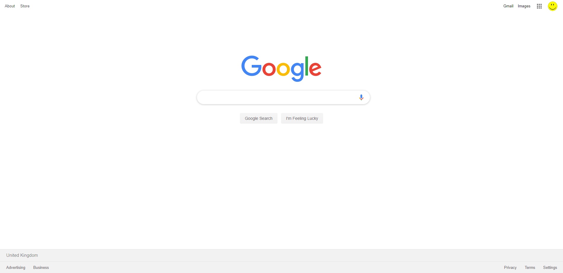
Take a look at the current Google homepage – a prime example of beautiful, simple and functional web design. It’s crisp, clean and white, with the main search box literally taking centre stage. Everything else is tidied to the edges, and both icons and text are used as shorthand in the top right corner menu. Will this become even simpler in future?
the irreducible simplicity acid test
If you want to apply the irreducible simplicity principle to your website, asking the following questions may help:
– Could the design be simplified?
– Is there anything extra that could be removed?
– How clearly are the main function(s) being promoted?
– Does the design do what it’s meant to do?
Expert web design is all about steering between simplicity and functionality – making sure the website is as minimalist as possible whilst still fulfilling its needs.
If you’d like expert, on-demand help with web design, please get in touch – we’d be delighted to discuss your requirements.


