action
We enjoyed a brilliant and collaborative partnership with Anti-Slavery International throughout the process, which began with a full user experience cycle. We researched the charity’s audience and delved into organisational strategy in order to work out what should and shouldn’t be on the site. We then proceeded to create an optimised information architecture aimed at engaging target users, with content that could be updated regularly and easily within staff time constraints.
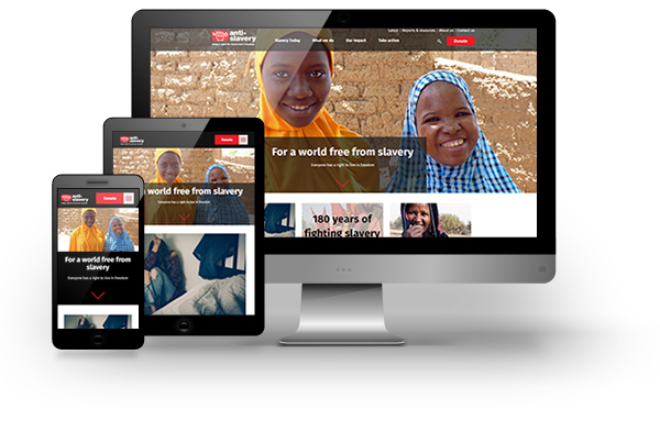
Using our expertise in charity web design, our WordPress developers created a new website that is bold, fully responsive, and has a clear navigation structure. This enables Anti-Slavery International to showcase its work in an engaging way and make excellent use of its impressive imagery and content. It is also able to fundraise more effectively online, with the site’s fundraising section divided to allow different donor groups to access the most relevant information and take action.
The template system we created for Anti-Slavery International has user experience at its heart and gives site administrators a broad range of simple-to-use tools to create compelling content. The charity is now able adapt quickly as its strategy evolves, without the need to keep coming back to us for changes – a testament to how well our partnership worked in creating a future-proof, scalable website that continues to meet Anti-Slavery International’s needs.


