action
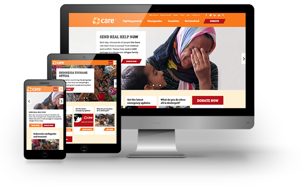
Using our expertise in charity website design, we created a single, responsive website, with clear user journey, accessible content and compelling calls to action. It features an improved structure, with layers of content suited to different devices, and an optimised donation funnel to encourage people to support the charity.
The new Drupal website design shouts about the organisation’s stories and shows what a difference is being made around the world. It follows a storytelling model, providing continuous relevant content to increase engagement. The new site is powerful and focused, leading users effectively to the areas of greatest interest and allowing them to read on and continue their journey from page to page.
Landing pages are now tied in with digital marketing campaigns, such that users are directed towards key content, all with online payment gateways to maximise fundraising. The new site was also designed to be stable and powerful enough to sustain the sudden surge in traffic and donations that Care experiences after major international disasters, as previously the website had crashed, resulting in a devastating loss of potential funds.


