the principles of Gestalt in web design

Gestalt is a German word that roughly translates as ‘unified whole’. Gestalt theory describes how humans typically see objects by grouping similar elements together and recognising the overall shape/pattern before seeing individual components and details. This is a natural psychological response in order to seek order amongst chaotic stimuli.
Using this psychological understanding, it’s possible to create designs which better engage users and feel more coherent and visually appealing. Ultimately, Gestalt design follows the concept that the whole is greater than the sum of the parts.
We will cover five of the key Gestalt principles that can be applied in web design – proximity, similarity, continuation, symmetry and closure…
1. proximity
The Gestalt law of proximity states that “objects or shapes that are close to one another appear to form groups”. Even if the shapes, sizes, and objects are radically different, they will appear as a group if they are close together. Good examples of proximity can be seen web design when menu links or buttons are kept close together, such that a sense of ‘unity’ and clarity is created between these elements.
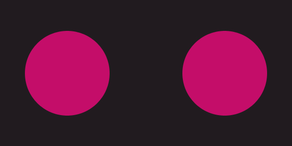
In the example below, as the squares on the left are placed without proximity, they are perceived as separate shapes; whereas the squares on the right are placed in close proximity and thus are perceived as a single group/shape.

2. similarity
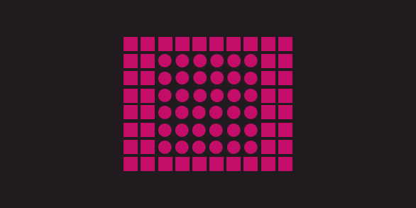
Gestalt theory states that things which share visual characteristics such as shape, size, colour, texture, or value will be seen as belonging together in the viewer’s mind. The example below shows how this works – although the shapes in the middle are different to the shapes on the outside, the image appears as a single unit because all the shapes have similarity. Unity occurs because the circles in the centre of the image look ‘similar’ to the squares in terms of size, colour and proximity.
When similarity occurs, an object is emphasised if it is dissimilar to the others. These anomalies create design focal points, which can be used to direct a user’s attention.

3. continuation
Continuation occurs when the eye is compelled to move along a path, line or object – preferring to see a single, continuous figure instead of separate lines. In the image below, this is seen as we perceive it as a cross shape instead of four separate lines meeting in the centre. This principle can be used in web design with lines or arrows leading towards buttons or content, and thus guiding focus towards what is most important.

4. symmetry
Symmetry states that the viewer should not be given the impression that something is out of balance, missing, or wrong. If an object is asymmetrical, the viewer wastes time trying to find the problem instead of engaging with the message or instruction.

5. closure
Closure occurs when an object is incomplete or a space is not fully enclosed. Preferring wholeness, people automatically fill in any gaps in order to perceive a complete image. The example below shows how closure can be applied in a logo – although the panda is not complete, there is enough present for the eye to complete the shape.

in conclusion…
Gestalt principles are pivotal for web design, as users need to be able to understand what they see – and follow instructions – quickly and easily. Without it, users may struggle to make associations between unrelated or clustered items and exit. It’s therefore well worth learning more about the principles and considering how they can be applied on your website.
If you’d like help updating your web design or improving user experience in any other way, please get in touch!


