header tail
branding for charities: key questions

branding for charities: key questions

branding for charities: key questions

home / Archives for April 2019

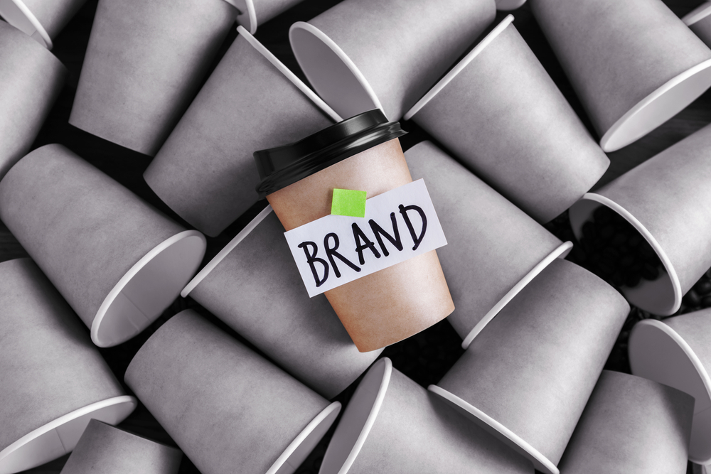
Branding for charities is a big challenge – how can you maintain a compelling, fresh and coherent profile in a brand-driven world whilst not spending donors’ money extravagantly and unnecessarily?

When Cancer Research UK spent £680,000 on a new logo and rebrand in 2012, it hit the headlines. But the charity was able to justify the expense, saying that “the cost of this work will be more than outweighed by the added income and support we will create by building a stronger brand which is distinct, stands out, and is more engaging. The cost is less than 0.2% of our annual income… and over five years, we expect this to equate to 0.03% of our projected income. This gives us confidence that the benefits of undertaking this change will easily outweigh the upfront investment.”

The total figure will be eye-watering for many charities, but spending 0.2% of annual income on a rebrand doesn’t sound too bad. Nevertheless, it can be challenging to justify the expense required for branding (and marketing) activities, when funds are finite and the main goal is to undertake charitable work.

Contemplating your charity brand

Is your charity’s brand tired or incoherent? Many people think that branding is little more than designing a logo and a strapline, but there is far more to it. Your charity brand includes your messaging, values and visual identity.

Here are a few key question to ask and think about before embarking on a refreshment or rebranding programme:

  • What exactly is wrong with your existing brand?
  • Does your brand support and showcase what your organisation does on a day-to-day basis?
  • How well does your brand engage with your target audiences?
  • What are the key messages/values you want your brand to convey?
  • Have you talked to all the different stakeholders – staff, trustees, donors, beneficiaries etc – and considered their input?
  • How would a refreshed brand impact fundraising activities?
  • What is your charity’s USP and how can this be conveyed through your brand?

Where to go next

There are often no definitive answers when it comes to choosing how best to spend your charity’s budget, but we believe that having a clear, coherent and appealing brand can have a significant and positive impact on supporter engagement and fundraising.

If you’d like flexible and cost-effective support with your charity’s brand development, please get in touch and we’ll be happy to help! We also recommend this great Charity Comms article on current charity branding trends.


top digital industry news – April 2019

top digital industry news – April 2019

top digital industry news – April 2019

home / Archives for April 2019

We share the digital industry’s best news stories, insights and tips from April 2019…

Pedalo & client news

  • We’re very pleased to share our latest web design for Oriel, an exciting new purpose-built facility that will bring together eye care, research and education for the first time
  • #RaiseYourWhisks to celebrate International Nurses Day and International Day of the Midwife in May with our clients Cavell Nurses’ Trust

web design & maintenance

SEO

marketing & social media

tech & digital

Don’t forget to follow us on Twitter and LinkedIn for regular news and updates. Or, for on-demand digital expertise, please get in touch and we’ll be happy to help!

pedalo launches new website for Oriel

pedalo launches new website for Oriel

pedalo launches new website for Oriel

home / Archives for April 2019

We’re very pleased to share our latest web design for Oriel

It’s estimated that four million people in the UK will be living with sight loss by 2050.

Oriel is the proposal to create a new, purpose-built centre of excellence for eye care, research and education – to provide patients with a place where they can experience the best care, and enable staff to make ground-breaking discoveries that will radically improve eye care across the UK and beyond. It’s a joint venture between Moorfields Eye Hospital, UCL and Moorfields Eye Charity.

The Oriel website has a slick design, with clear information about the project, its impact, and how people can get involved. It highlights the proposal’s exciting vision, and makes excellent use of the imagery across the site.

Visit the new Oriel website now at www.oriel-london.org.uk.

If you’d like help designing an awesome new website for your organisation, give us a call on 020 8747 3274 and we’ll be happy to help.

the principles of Gestalt in web design

the principles of Gestalt in web design

the principles of Gestalt in web design

home / Archives for April 2019

Gestalt is a German word that roughly translates as ‘unified whole’. Gestalt theory describes how humans typically see objects by grouping similar elements together and recognising the overall shape/pattern before seeing individual components and details. This is a natural psychological response in order to seek order amongst chaotic stimuli.

Using this psychological understanding, it’s possible to create designs which better engage users and feel more coherent and visually appealing. Ultimately, Gestalt design follows the concept that the whole is greater than the sum of the parts.

We will cover five of the key Gestalt principles that can be applied in web design – proximity, similarity, continuation, symmetry and closure…

1. proximity

The Gestalt law of proximity states that “objects or shapes that are close to one another appear to form groups”. Even if the shapes, sizes, and objects are radically different, they will appear as a group if they are close together. Good examples of proximity can be seen web design when menu links or buttons are kept close together, such that a sense of ‘unity’ and clarity is created between these elements.

In the example below, as the squares on the left are placed without proximity, they are perceived as separate shapes; whereas the squares on the right are placed in close proximity and thus are perceived as a single group/shape.

Gestalt principle of proximity

2. similarity

Gestalt theory states that things which share visual characteristics such as shape, size, colour, texture, or value will be seen as belonging together in the viewer’s mind. The example below shows how this works – although the shapes in the middle are different to the shapes on the outside, the image appears as a single unit because all the shapes have similarity. Unity occurs because the circles in the centre of the image look ‘similar’ to the squares in terms of size, colour and proximity.

When similarity occurs, an object is emphasised if it is dissimilar to the others. These anomalies create design focal points, which can be used to direct a user’s attention.

Gestalt principle of similarity

3. continuation

Continuation occurs when the eye is compelled to move along a path, line or object – preferring to see a single, continuous figure instead of separate lines. In the image below, this is seen as we perceive it as a cross shape instead of four separate lines meeting in the centre. This principle can be used in web design with lines or arrows leading towards buttons or content, and thus guiding focus towards what is most important.

Gestalt principle of continuation

4. symmetry

Symmetry states that the viewer should not be given the impression that something is out of balance, missing, or wrong.  If an object is asymmetrical, the viewer wastes time trying to find the problem instead of engaging with the message or instruction.

Gestalt principle of symmetry

5. closure

Closure occurs when an object is incomplete or a space is not fully enclosed. Preferring wholeness, people automatically fill in any gaps in order to perceive a complete image. The example below shows how closure can be applied in a logo – although the panda is not complete, there is enough present for the eye to complete the shape.

in conclusion…

Gestalt principles are pivotal for web design, as users need to be able to understand what they see – and follow instructions – quickly and easily. Without it, users may struggle to make associations between unrelated or clustered items and exit. It’s therefore well worth learning more about the principles and considering how they can be applied on your website.

If you’d like help updating your web design or improving user experience in any other way, please get in touch!