header tail
top digital industry news – March 2019

top digital industry news – March 2019

top digital industry news – March 2019

home / Archives for March 2019

We share the digital industry’s best news stories, insights and tips from March 2019…

Pedalo & client news

web design & maintenance

SEO

marketing & social media

tech & digital

Don’t forget to follow us on Twitter and LinkedIn for regular news and updates. Or, for on-demand digital expertise, please get in touch and we’ll be happy to help!

what’s in a wireframe? everything you need to know

what’s in a wireframe? everything you need to know

what’s in a wireframe? everything you need to know

home / Archives for March 2019

We share everything you need to know about wireframes…

what are wireframes?

Wireframes are like an engineer’s blueprint or an architect’s drawings – they’re an in-depth plan of the layout and functionality of a website. They vary widely depending on the designer, project, and purpose, but they are generally images representing the digital product in grayscale, showing navigation structures, representative or dummy content, calls to action, imagery (and other media requirements), form elements, and advert placements.

Wireframes don’t include graphic design elements (such as final imagery or fonts), but they lay out the entire structure of your website in detail – including all site pages, where each button leads, and what happens when you interact with each section/item on a page. Wireframes are often annotated with functional descriptions (eg. when the user clicks on ‘ok’, the dialog box is closed), content requirements, and user goals.

why are wireframes important?

Wireframes enable everyone to visualise a new website, and allow design ideas to be iterated, explored and tested. Wireframes are meant to be shared, scrutinised, and collaborated on – they allow us to learn about and improve how a site will function before the time-consuming aesthetic graphic design begins. They mean we can think about and plan ahead for every scenario a user could encounter when using the site.

Good wireframes pave the path for an entire web project and ensure a smooth transition into design and development phases; they also save investment of time and money in the long-run.

when should wireframes be created?

It’s best to create wireframes towards the beginning of a web design project, when ideas can be tested out and changes  made relatively inexpensively.

We create wireframes every time we work on a design project. Sometimes they are just a couple of basic pages for internal use that enable us to visualise and reflect on our ideas. Sometimes they are more like detailed and interactive prototypes which are shared with a wide range of stakeholders and go through several iterations.

what are wireframes communicating?

A well-presented wireframe helps the project team understand the ideal layout and functionality for a website, thus enhancing both stakeholder alignment and the quality of the final website design. Wireframes are key piece of UX documentation that are relatively quick and cost-effective to produce.

Wireframes communicate the following key elements:

  • Layout: the structure of the page and where different content is placed; we can then easily test out alternative layouts to see which works best for users.
  • Priority/focus: what is the priority or key element on each page – where do we want users to look and what do we need them to do?
  • Navigation: how users find information and move around the site; we can try out different navigational approaches.
  • Content and images: what are the content and image requirements for each page?
  • Functionality: how should users interact with the page, and does it look the way it works?

who is the intended audience for wireframes?

Involving a wide range of stakeholders in wireframe development enables us to discuss content and functionality without the potential distraction of colours, styling and imagery.

These are the common groups involved during a wireframe design sign-off process:

  • Web designers – they want to understand the content needs, visual hierarchy, and how we intend users to interact, looking for common elements and grid layout.
  • Web developers – they need to understand the structure and how functionality works, both in the front and back-end.
  • Project managers – they want to make sure that the site can be built on time and to budget and meets the aims and objectives of the project.
  • Clients – staff, supporters and users can all feed into the process with their observations and comments about navigation, interactions, and content.

If you’re planning a web build and would like help with wireframes, please get in touch.

is your website accessible? [infographic]

is your website accessible? [infographic]

is your website accessible? [infographic]

home / Archives for March 2019

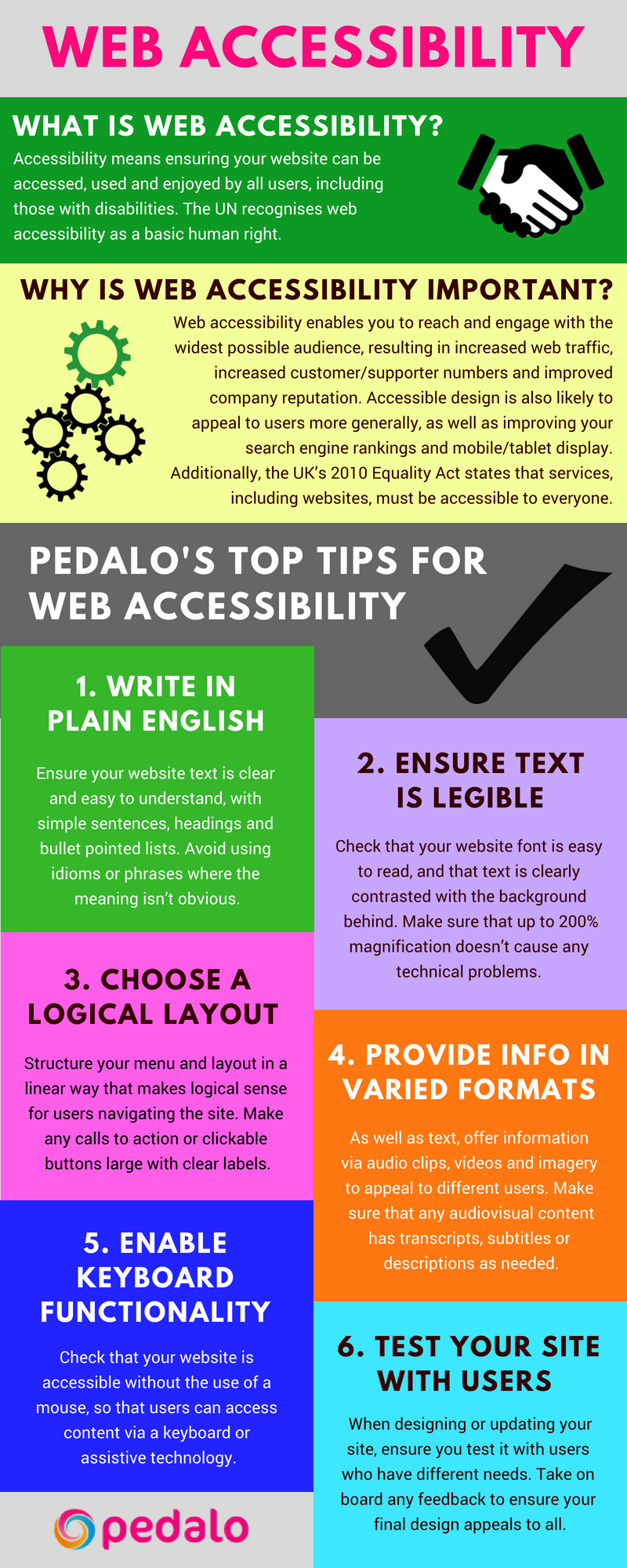
Web accessibility means ensuring your website can be accessed, used and enjoyed by all users, including those with disabilities. Our infographic and resources below will help you ensure your site is accessible to all.

why is web accessibility important?

Web accessibility enables you to reach and engage with the widest possible audience, resulting in increased web traffic, increased customer/supporter numbers and an improved company reputation. Accessible design is also likely to appeal to users more generally, as well as improving your search engine rankings and mobile/tablet display.

Additionally, the UK’s 2010 Equality Act states that services must be accessible to everyone who needs them, so if you have an inaccessible website you may be breaking the law.

Find out more about how to make your website accessible in our infographic below:

Accessibility infographic by Pedalo  

other web accessibility resources

  • W3.org has extensive information about accessibility testing
  • Gov.uk has guidance on appealing to people with specific needs, including those with low vision, deafness, dyslexia, autism and motor disabilities
  • Gov.uk also has guidance on testing for accessibility and meeting the Equality Act 2010 requirements
  • The RNIB website has information on accessibility for blind and partially sighted people
  • Wave offers a web accessibility evaluation tool

For on-demand help with accessibility or website performance optimisation, please get in touch and we’ll be happy to help. 

the best charity websites (& how to make your charity web design stand out)

the best charity websites (& how to make your charity web design stand out)

the best charity websites (& how to make your charity web design stand out)

home / Archives for March 2019

We’ve been searching high and low around the internet for the best charity websites. Coming from a user/consumer perspective, we looked at hundreds of charity homepages, and considered which sites are the easiest to navigate, most user-friendly and have the clearest messaging.

We share our seven favourite charity website designs below…


what the best charity websites do

Website users are generally pretty impatient so charity websites need to deliver a clear and engaging message in an instant. Otherwise, they run the risk of losing potential donors/supporters before the site has had a chance to get its case across.

The best sites have compassion for the user – not overloading them with choices or too much text, and instead making calls to action obvious and ensuring that users can easily find further information as needed.

The best charity websites have several things in common:

  • They use excellent imagery and graphics to create instant impact
  • They have clear calls to action, encouraging users to support of the charity by making a donation, volunteering or signing a petition
  • They have informative menu options, making them easy to navigate
  • They have compelling stats and/or infographics to show the impact of the charity’s work
  • They use a clean and clear design, without too much text

Whilst larger charities obviously have larger budgets and therefore can afford more jazzy designs and functionality, they also often have more projects and strands of work, making it harder to convey their key messages and calls to action.

We believe that great charity website design – including all of the above – is possible regardless of budget. Here are our seven favourite charity websites…

1. Care International

Care International charity web design homepage

2. WWF

WWF charity web design homepage

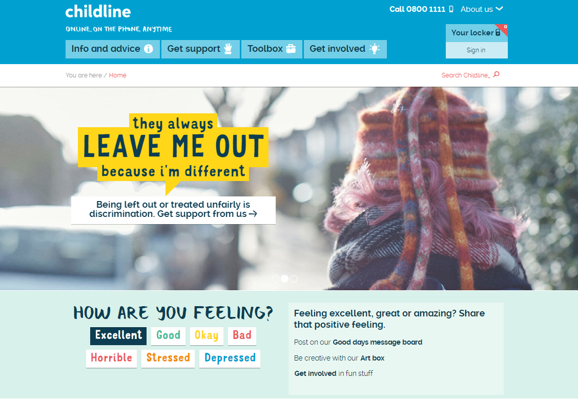
3. Childline

Childline charity web design homepage

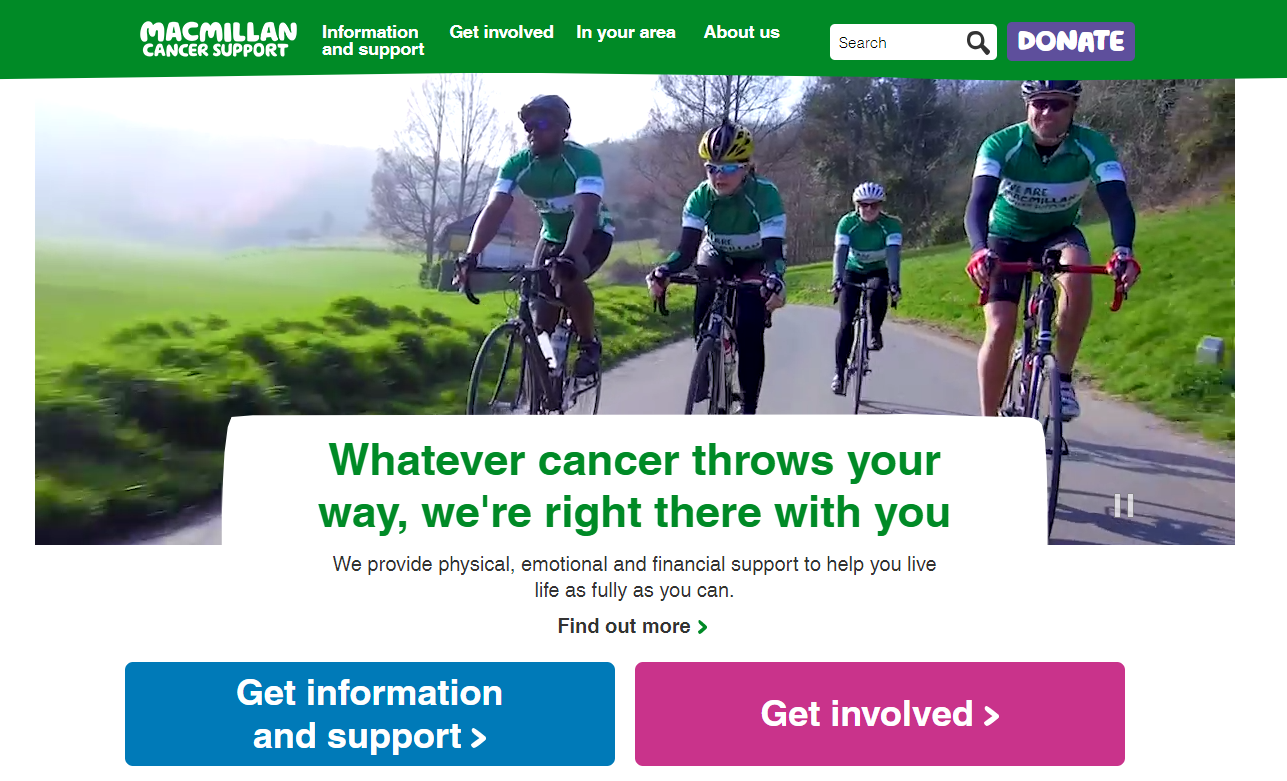
4. Macmillan Cancer

MacMillan charity web design homepage

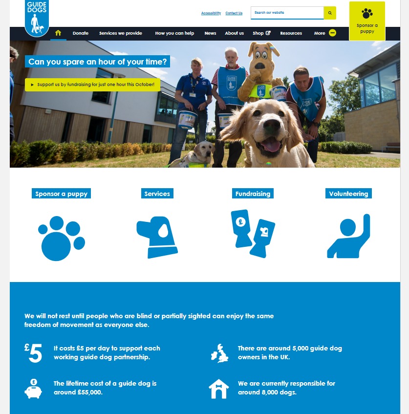
5. Guide Dogs

Guide Dogs charity web design homepage

6. Crisis

Crisis charity web design homepage

7. Mind

Mind charity web design homepage

how to improve your charity website design

We recommend these three steps to improve the design of your charity website:

  1. Think about the user – what do they want to know and what do you need to tell them? Make your messages clear and consise to avoid overwhelming users with too much information.
  2. Use imagery – ‘a picture paints a thousand words’ as they say, so use great images to represent your charity’s work. If you don’t have your own photos, it may be worth searching online for stock photography.
  3. Ask for donations/support – it’s important to be bold to ensure users know that you need their donations and other help to make the world a better place. Explain exactly how donations are used and/or what other support is needed, and make any payment or sign-up processes as simple as possible.

need help?

We’ve designed websites for numerous charities and not-for-profit organisations including World Cancer Research Fund, Anti-Slavery International, Care International and The Fostering Network.

We understand the challenges charities face and are passionate about helping you reach your target audiences, increase fundraising conversions, convey key messages and improve user engagement. Get in touch or visit our charity services page for more information.

We’re aware that we may have missed some amazing charity websites so if you know of any that we’ve omitted, please get in touch and let us know!