header tail
writing well for the web

writing well for the web

writing well for the web

home / Archives for January 2018

Writing well isn’t easy – and writing well for the web is an even harder challenge. With so much choice (and so many distracting cat videos!) online, it’s hard to get and retain people’s attention. We share some key considerations and tips to help you achieve success with your online writing…

1. write for brief attention spans

People browse online in a wide range of environments and situations, including busy offices, whilst commuting, when waiting for children to come out from school, and at the end of the day in bed. With a range of distractions always vying for users’ attention, your writing needs to be short, snappy and focused so that it captivates users quickly.

2. understand users’ motives

There’s no ‘typical’ user but it is possible to identify the key motives that most people will have when they find your pages. Whether they’re seeking information, want to purchase something, or are simply filling time, they’re looking to your site to resolve a problem or need. The key point here is that your writing needs to focus on these user motives – it seems like an obvious point but it’s surprising how often users are forgotten, with poor writing focusing on the author’s needs and motives instead.

3. remember you’re being judged

Users will constantly be assessing your content – is it relevant, interesting, useful, easy to access etc? There’s a lot of competition online so users won’t stay on your website if they think they can find better content elsewhere. Every piece of information on your site needs to stand up to scrutiny and encourage users to keep reading.

4. construct text effectively

It’s important to structure your writing and webpages to make them easy and enjoyable to skim and read:

  • Start with a short overview so users can identify that they’re in the right place
  • Include headings to break up text and highlight important points
  • Use bullet point lists to convey key information in snappy, digestible chunks
  • Use bold or italics for keywords or phrases that you want to stand out
  • Increase the level of detail as you go down the page so that your user is eased in and can find the simplest information straightaway

5. enhance words with imagery

Use relevant images to give users something to anchor onto as they scan your page. People are very visually-oriented online and typically digest and assess the content of an image well before they have read any of the words on a page. Including pictures also enhances users’ abilities to retain and remember written content.

6. include links

Provide links to other relevant content on your site within the main body of the text, so that users have further options to explore. If you’re providing technical information or complex concepts, offering downloadable PDFs or similar may be useful so that users can download your content and digest it in a more thoughtful manner later. It’s also advisable to provide links to other content that may be of interest at the end of your article, so that you don’t leave users at a ‘dead-end’.

in conclusion

The key to excellent writing for the web is making your text relevant for users, keeping it as short and snappy as possible, making it easy to skim with bullet points and headings, including links to other relevant information, and including attractive and engaging imagery. It can take a while to develop online writing skills, but follow these tips and remember that practice makes perfect, and you can’t go far wrong!

For on-demand help with content marketing, please get in touch.

getting it all in proportion: imagery for websites

getting it all in proportion: imagery for websites

getting it all in proportion: imagery for websites

home / Archives for January 2018

Choosing the right imagery for your website can be a real challenge. Pictures need to reflect – or at least not clash with – the headlines and text that they illustrate. We share our tips for getting your website images right…

why is website imagery important?

Images are becoming increasingly important online. Remember that old adage – a picture says a thousand words. Great imagery gives stories impact, gains users’ attention and even helps people retain information:

When people read information, they’re likely to remember only 10% of that information three days later. However, if a relevant image is paired with that same information, people retain 65% of the information.
Lifelearn.com

where can you find digital imagery?

Most of us don’t have the time, skill or resources to create our own imagery, so online picture libraries are an invaluable tool. There are hundreds of these online offering images free or for a cost, with wide-ranging quality levels.

Sifting your way through large collections of images can be time-consuming and hard work. Not only may you be unsure what type of image you need, but you also have to ‘translate’ what you’re looking for into keywords for the picture library search engines. This can be a challenge as it involves guessing how the photographers and artists (from around the world, so their first language may not be the same as yours) have tagged their images.

the importance of image shape

What picture shapes work well on a website? This depends on your particular website, but web design and technology trends are increasingly favouring certain shapes.

For instance, if you look through WordPress web design themes, you can’t fail to notice a preponderance of wide, low images – the ‘letterbox’ shape. Whilst designers love this shape, the internet is littered with poorly-cropped images where people have tried to squeeze pictures into the ‘letterbox’ formats and failed. Even where the image itself has been cropped effectively, it is often obscured by or loses impact because of text on top.

Of course, there is a reason for the ‘letterbox’ trend of course – in order to fit a top banner, logo, main navigation and homepage ‘hero’ image into a desktop browser window, this is the shape you need. But because of the challenge with letterbox images, it’s often worth paying more for this image or getting a professional designer to help.

Across other website pages, more standard aspect ratios are often used. An aspect ratio of 16:9 (the shape of a HD TV screen) is very common now. These shapes are similar to those coming directly out of cameras, so much easier to crop, edit and use for web design.

responsive design & picture shapes

On smaller screens, both portrait shapes and squares will display larger than landscape shapes if the device is held vertically. Bearing this in mind could change your whole approach to image shapes. The question then becomes – how are most people viewing your site? If you have more desktop users then landscape images will work well, but if you’ve got more tablet and mobile users then squares or portrait shapes might be preferable.

Ultimately, there’s a place for every shape of picture on your website – but they won’t all fit every slot on every page. Finding the right shape and style of image for each page is all part of the exciting process of designing the content for your site.

For on-demand help with web design or content marketing, please get in touch.

metadata: the basics [infographic]

metadata: the basics [infographic]

metadata: the basics [infographic]

home / Archives for January 2018

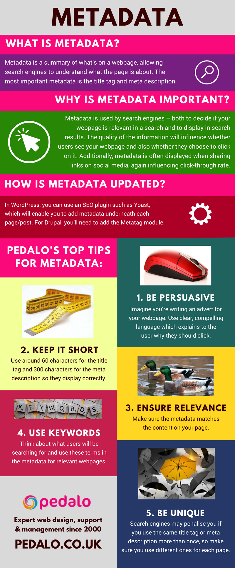
Is your website’s metadata helping or hindering your online results? Our infographic covers the basics of metadata so you can ensure great website performance and SEO.

Metadata infographic by Pedalo

Would you prefer not to worry about metadata? Our on-demand digital support is flexible and economical – please get in touch for more information or to discuss your requirements.

security patching: why it’s essential

security patching: why it’s essential

security patching: why it’s essential

home / Archives for January 2018

We explain why regular security patching a crucial part of website maintenance

what is a security patch?

A security patch is a small piece of software which fixes and ‘plugs’ any vulnerabilities, bugs or other problems on your website which could pose a security threat.

why do I need security patching?

New vulnerabilities are being uncovered in website software all the time; automated bots are constantly active across the internet searching for software weaknesses. Any ‘holes’ in your site can be exploited, possibly enabling hackers to access clients’ data and payment information, send out spam, or make changes to your site, with severe consequences.

6 simple tips for security patching:

  • Check your website software is up to date and fully supported
  • Apply automatic updates so that any general patches are implemented as soon as possible
  • Ensure you and your users use strong passwords (with unusual character combinations) to access your site
  • Encrypt your site data using HTTPS
  • Test security patches first to ensure they don’t introduce new problems, such as disabling features or reducing functionality
  • Ensure all devices you use have adequate security and anti-virus protection

If you’d like help with security or any other aspect of website management and support, please get in touch and we’ll be happy to help!